CreatorKiwi
Designing Clarity for Creators

About the project
Creators have more data than ever, but what they’re truly missing is clarity. Most analytics platforms flood them with dashboards, percentages, and performance metrics that look sophisticated but leave them staring at the same unanswered question: What should I make next?
CreatorKiwi approached us to help shift the conversation from measurement to momentum. Together, we reimagined analytics not as a scoreboard, but as a creative compass, a tool that surfaces patterns instead of piling on numbers.
The truth
Content creators are drowning in data: views, retention curves, impressions, CTRs. Information is abundant, but clarity is not. The real issue was never the volume of data, but the lack of meaningful signals within it.
The pattern
Our task as brand strategists and designers was to reimagine analytics as a creative ally. We developed a positioning direction, visual system, and product experience that make insight feel empowering rather than intimidating. The brand needed to feel sharp but optimistic: smart but human.
The core
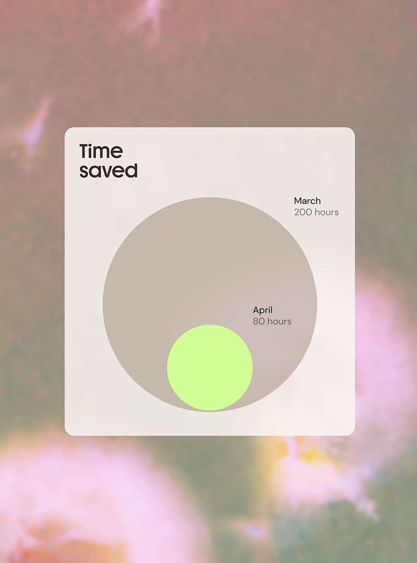
We reframed data from performance scorecard to creative compass. As designers, we built a brand identity that feels energizing, intuitive, and forward-moving. Instead of amplifying complexity, CreatorKiwi surfaces patterns that guide creators toward their next move.

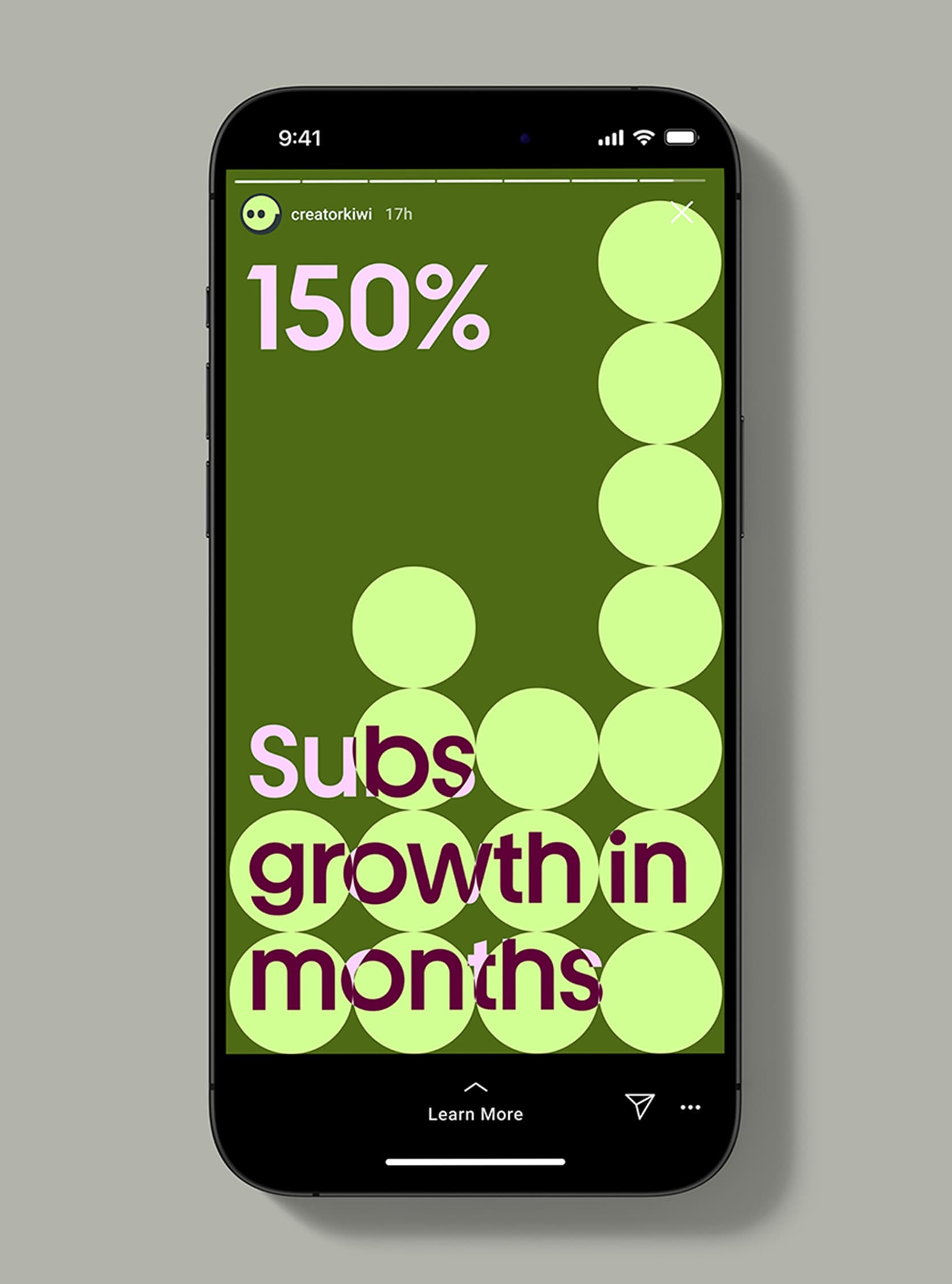
The form
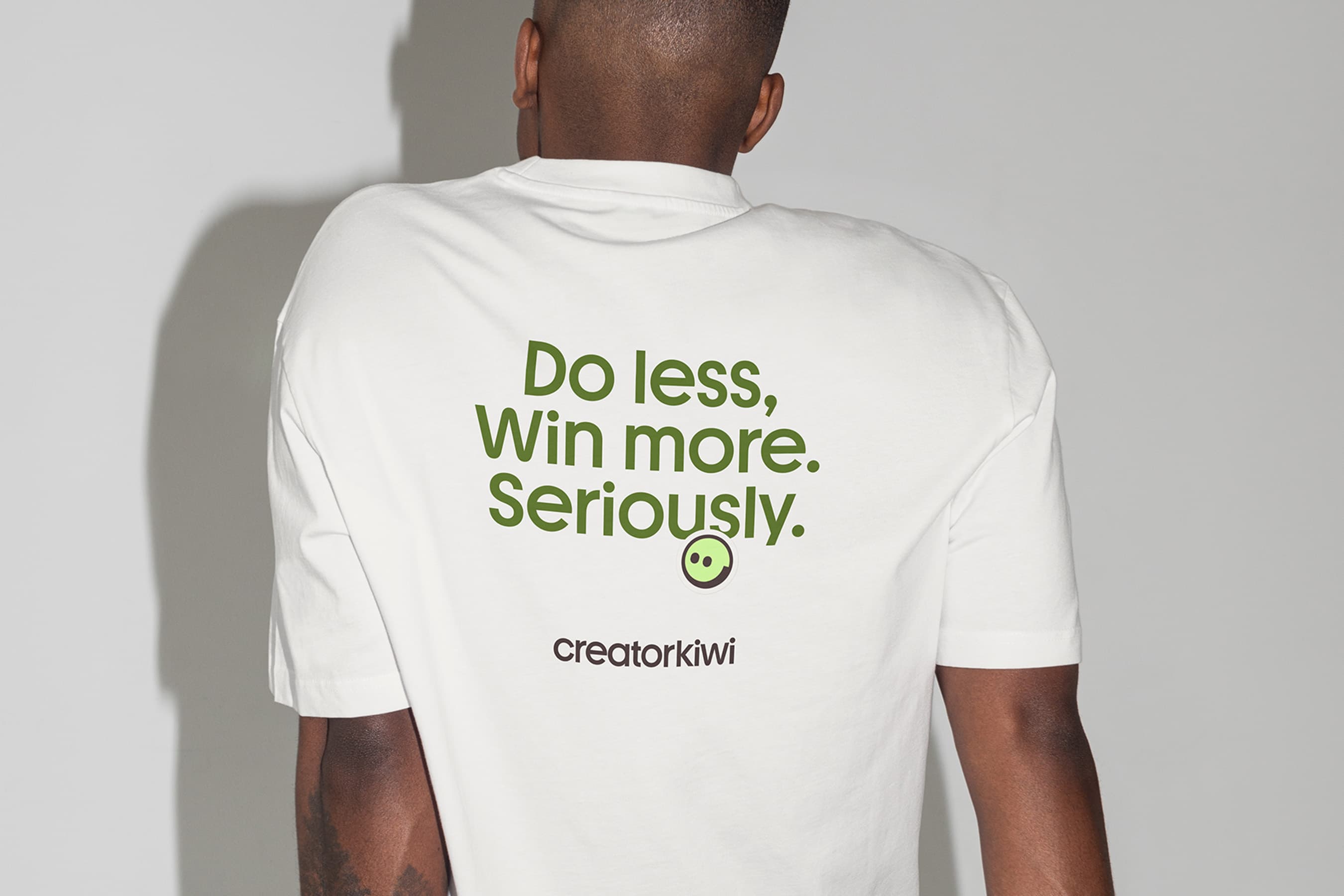
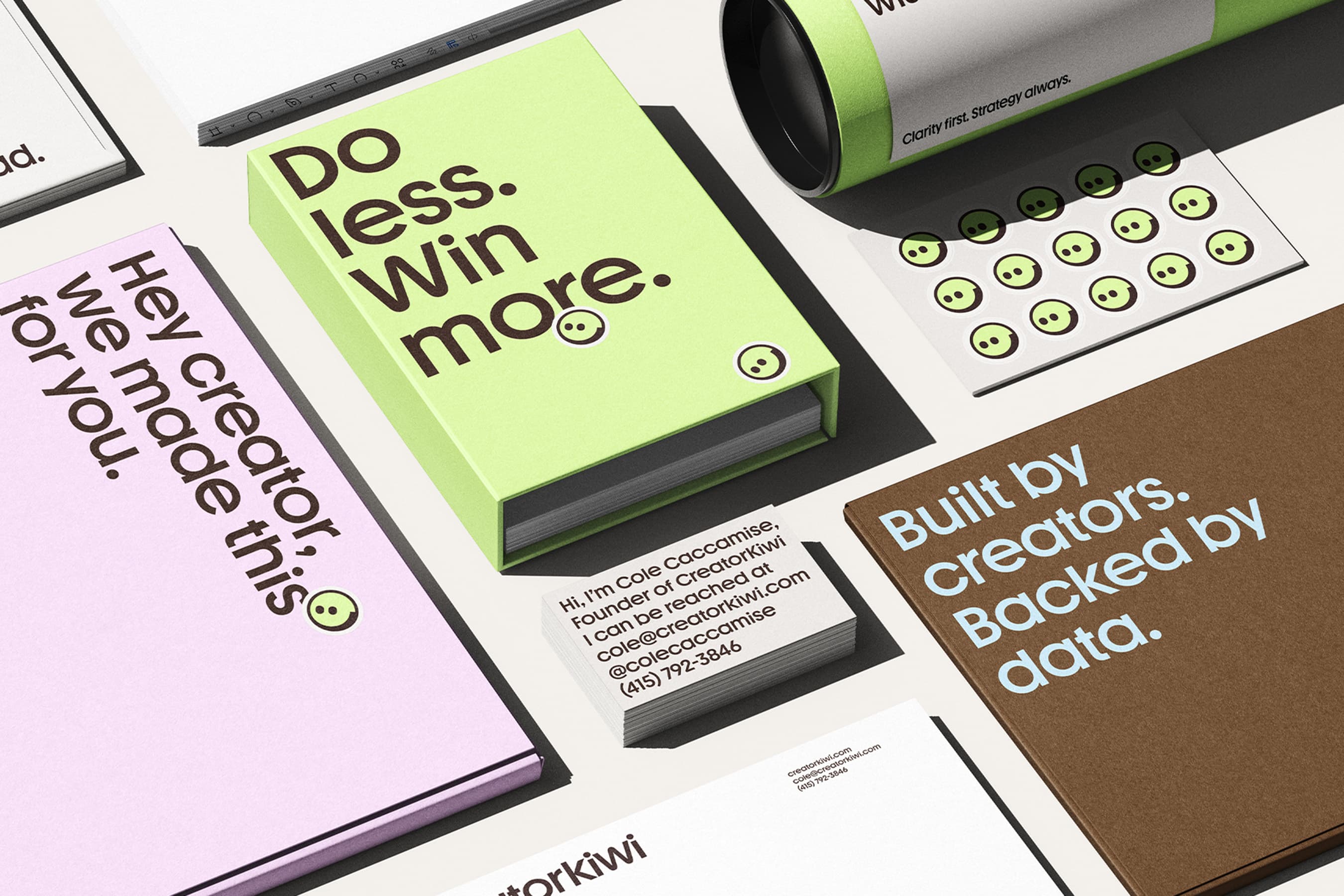
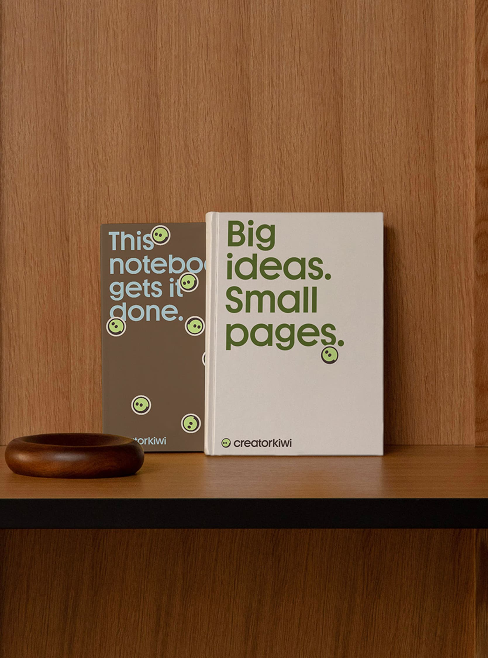
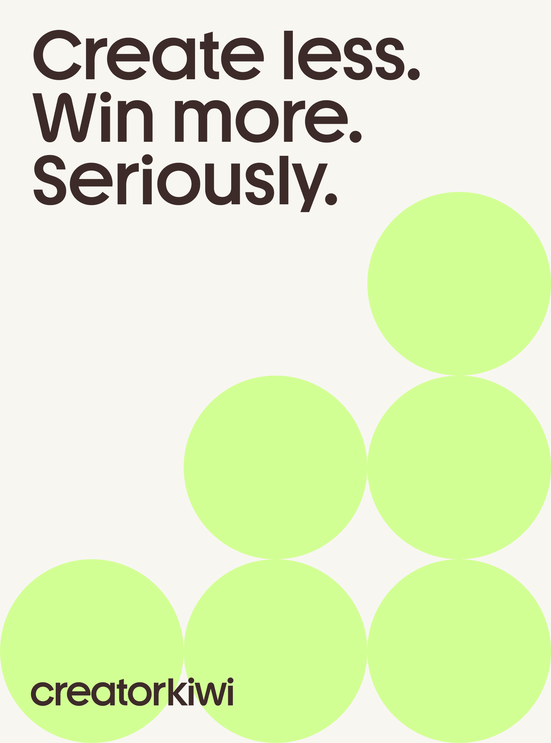
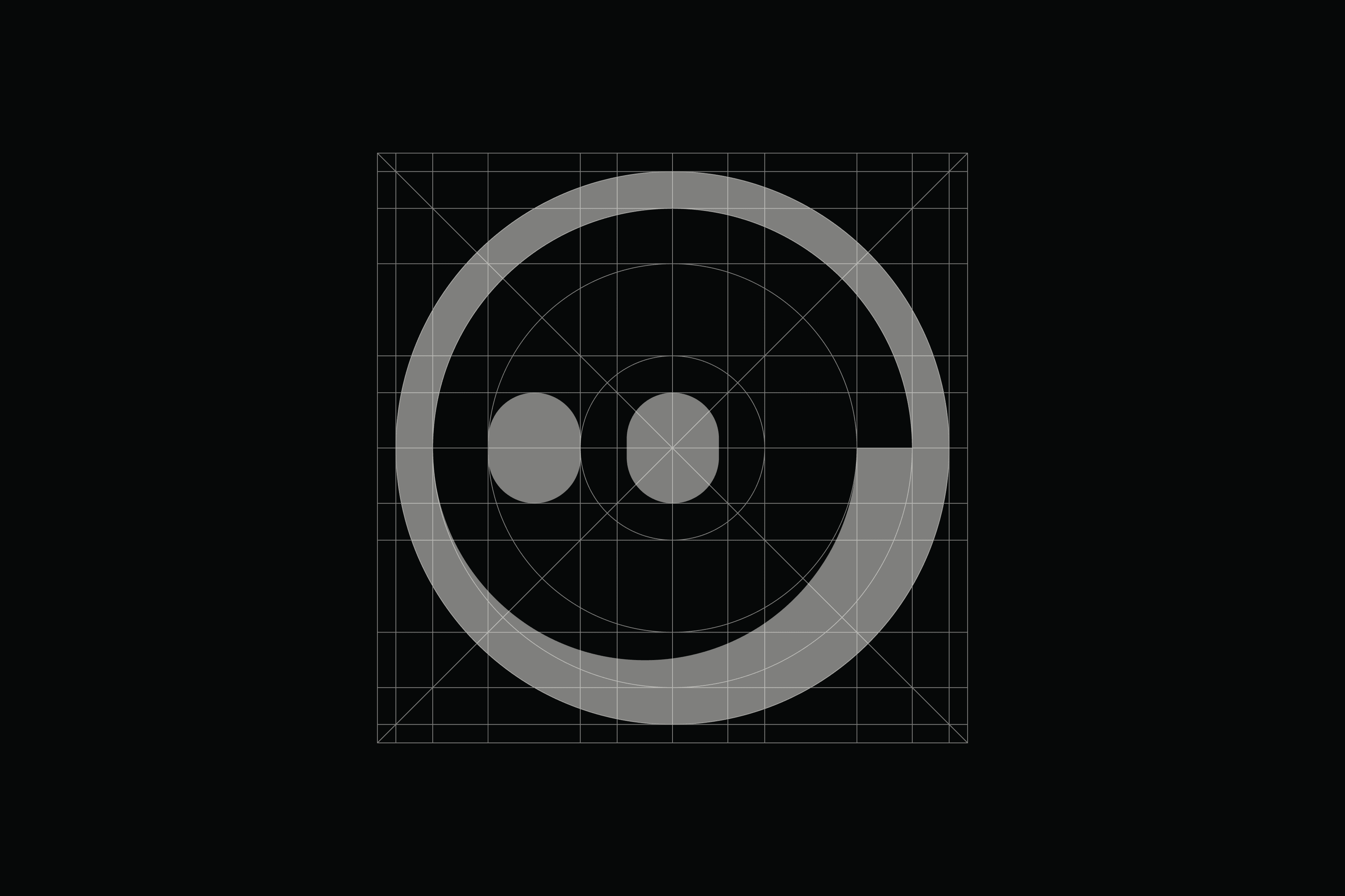
The visual identity centers around Kiwi green, a vibrant yet intelligent tone that signals clarity and motion.
The logo and brand mark introduce personality without sacrificing credibility. Geometric compositions and modular layouts reflect structured thinking, while playful accents and rounded forms maintain accessibility.
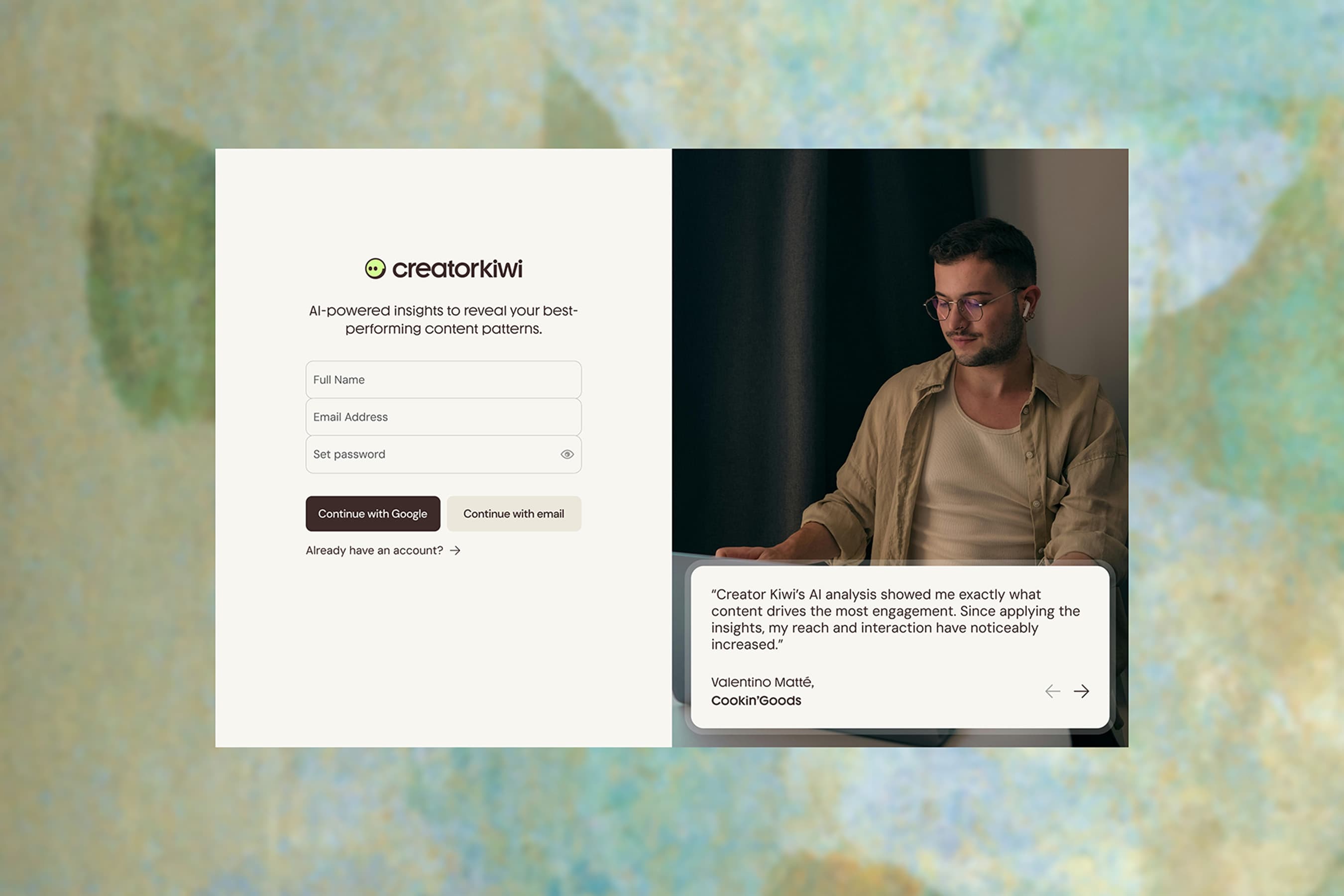
Typography balances authority with approachability. The interface design prioritizes simplicity, ensuring creators feel guided rather than evaluated.