Phreshly
A Cocktail Brand That Knows Where Its Roots
About the project
Premium cocktails often treat culture as optional, something added for decoration rather than meaning.
Phreshly saw it differently, and that’s why they asked us to help shape their identity.
For Black consumers, authenticity isn’t a layer you add at the end. It’s the foundation. Instead of smoothing out their identity to appeal to everyone, Phreshly chose to honor it. The brand embraces cultural pride through premium ingredients, thoughtful design, and a visual language that feels rooted rather than repackaged.
The truth
Premium spirits frequently neutralize identity to appear “universal.” In the process, culture becomes muted, and authenticity feels compromised. Phreshly didn’t need to code-switch, only to elevate.
The pattern
The category often signals luxury through minimalism and restraint, sometimes at the cost of personality. Our challenge was to create a brand strategy and identity that felt sophisticated without becoming culturally diluted.
The core
The strategy for positioning was to reframe premium spirits from cultural compromise to cultural celebration. Heritage became the differentiator, and authenticity became an advantage.
The form
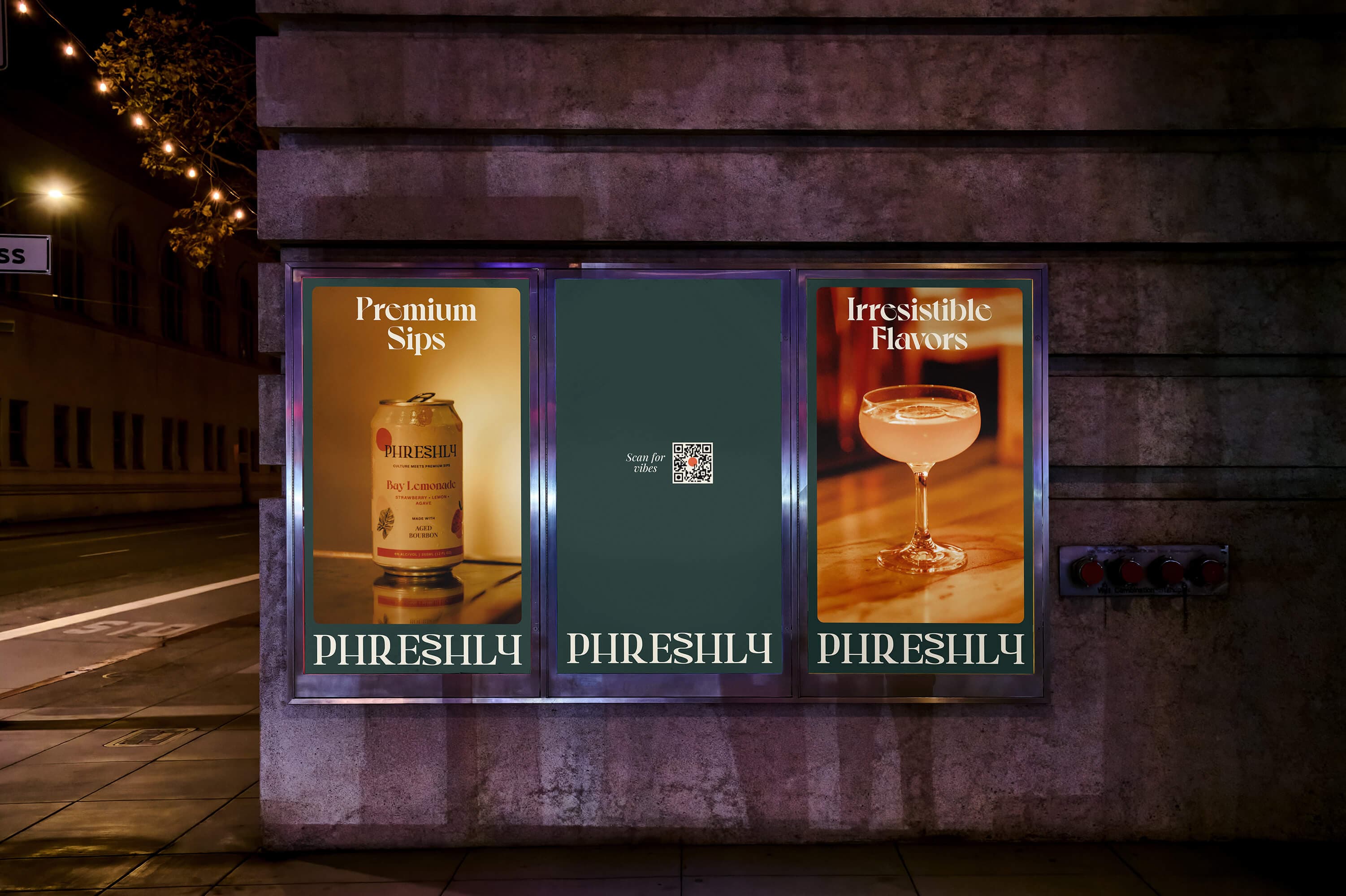
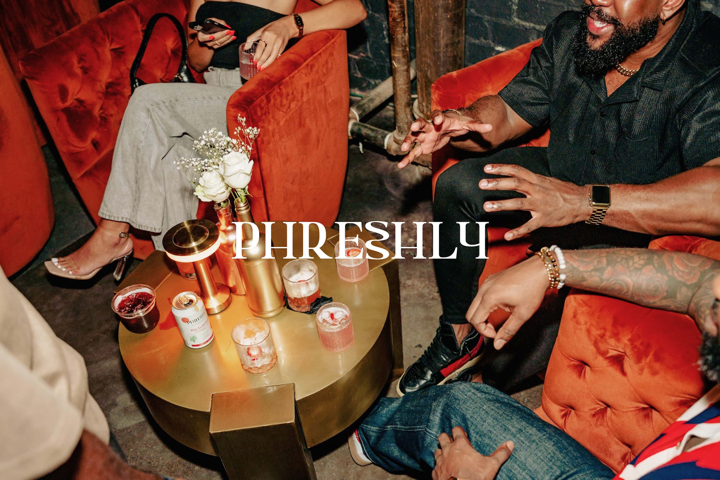
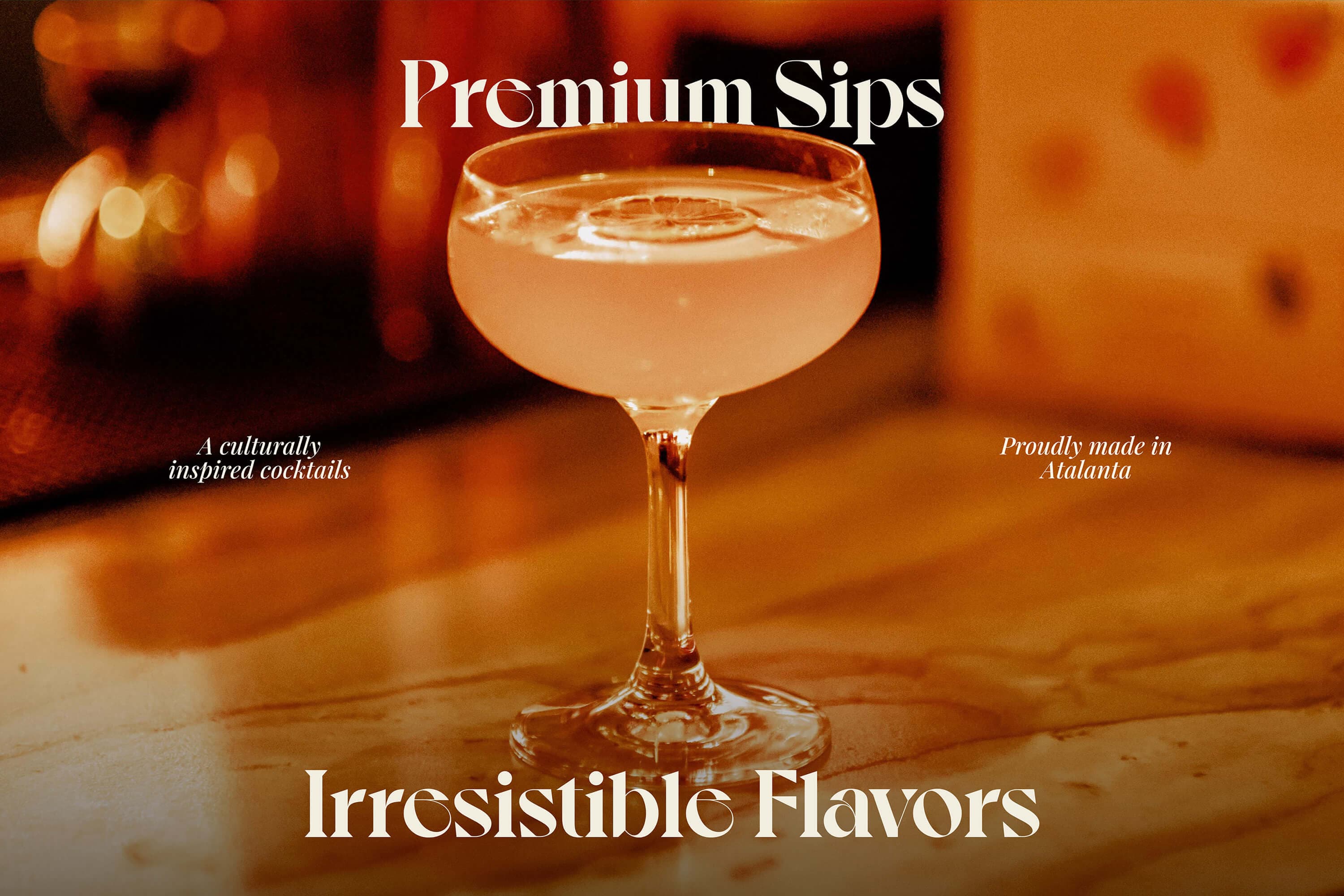
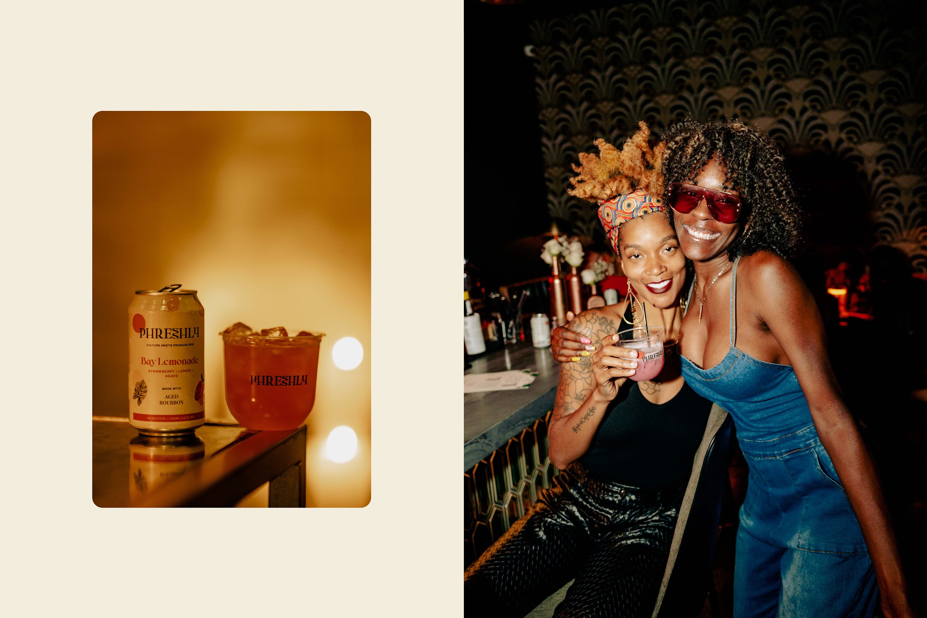
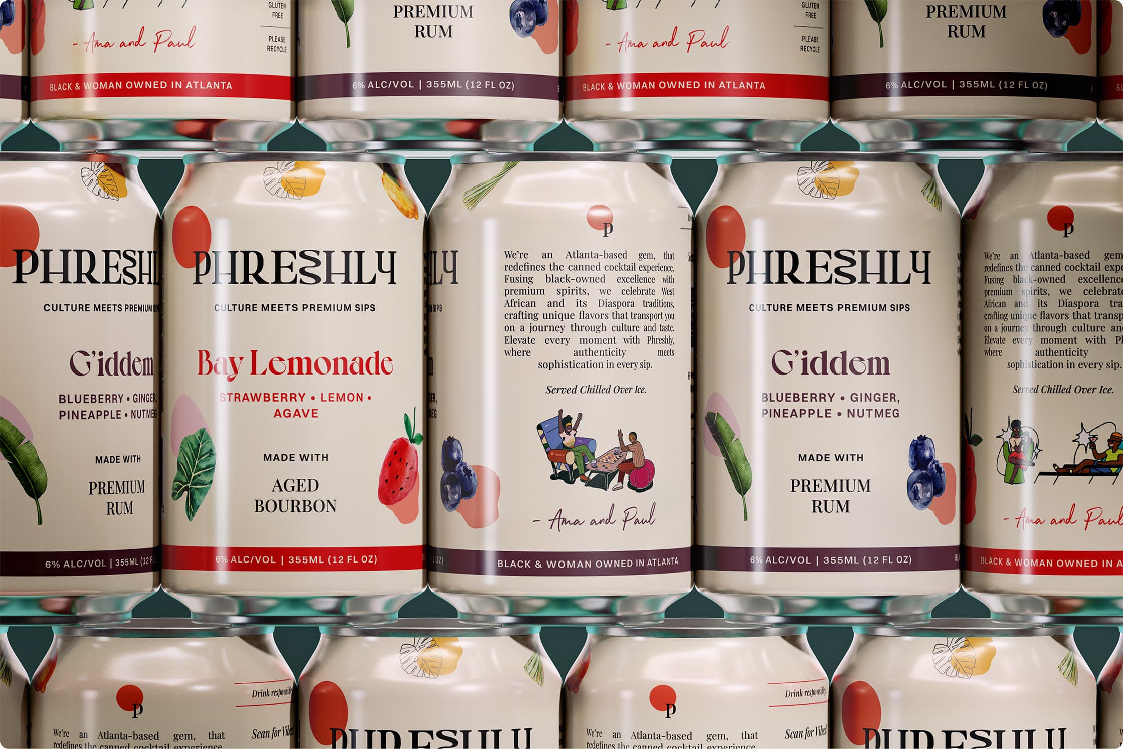
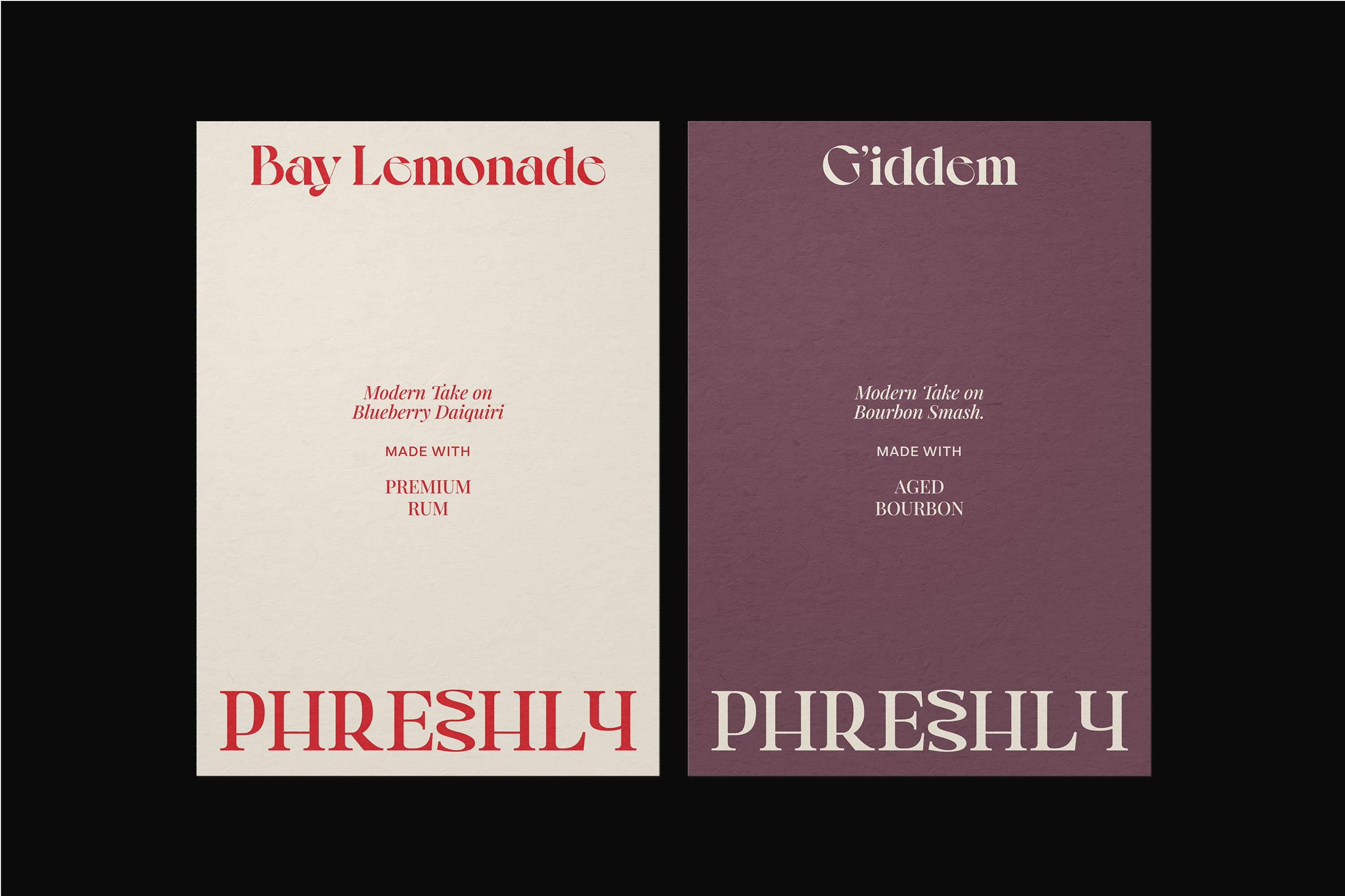
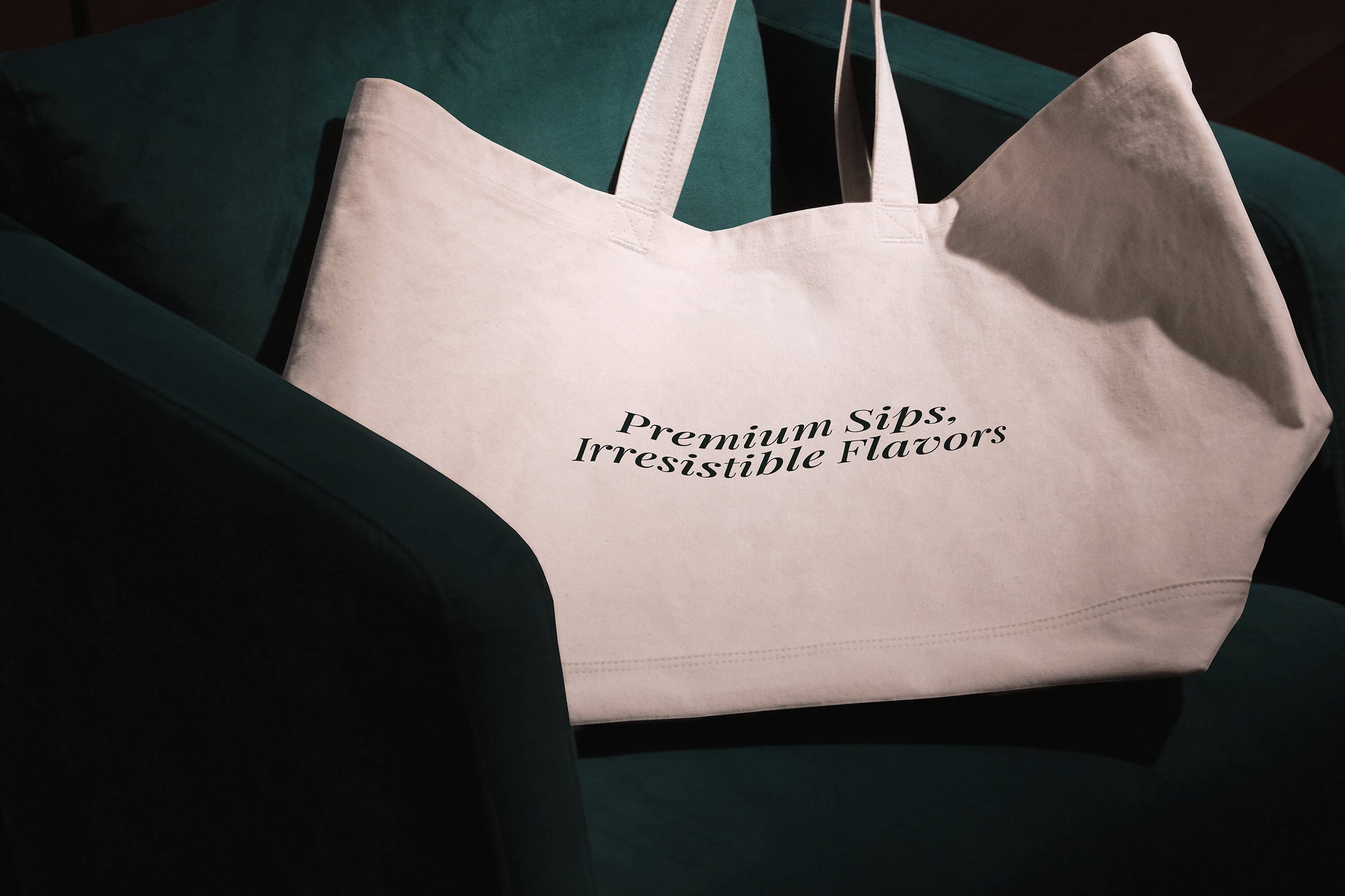
The identity balances refinement with vibrancy.
The elegant serif typography communicates sophistication without abandoning cultural voice.
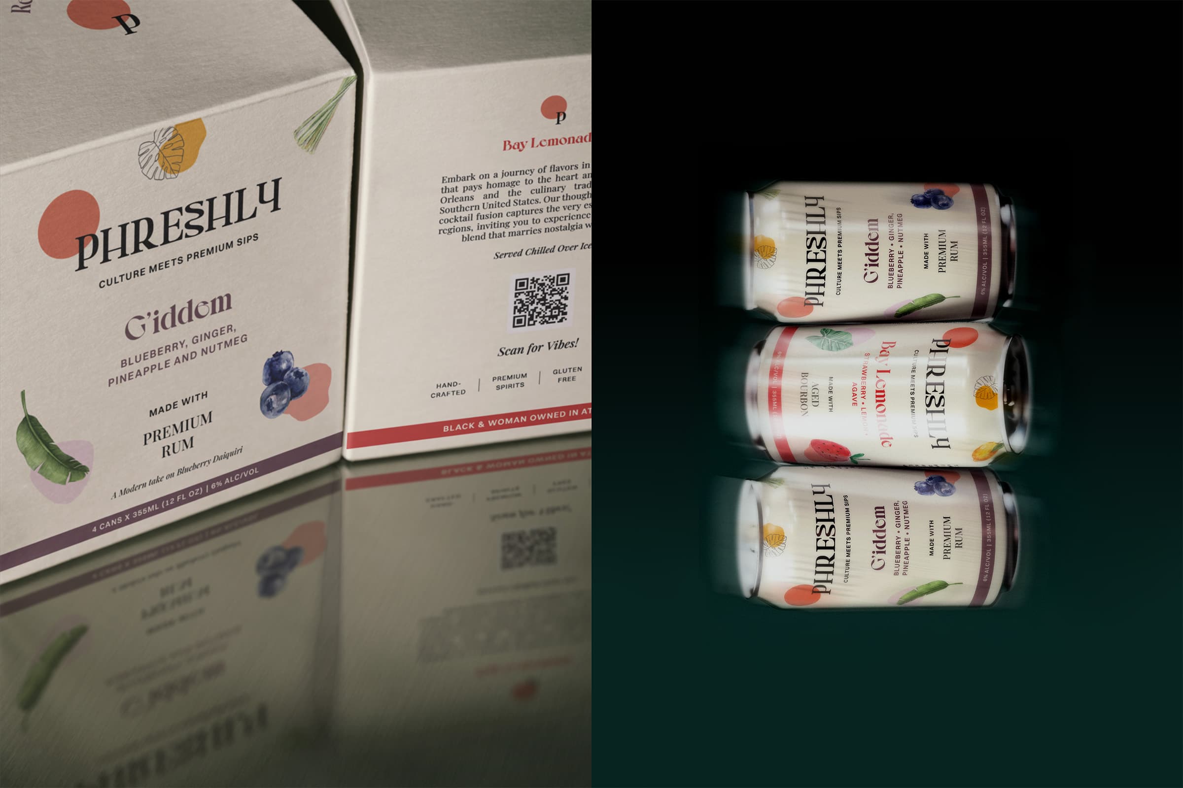
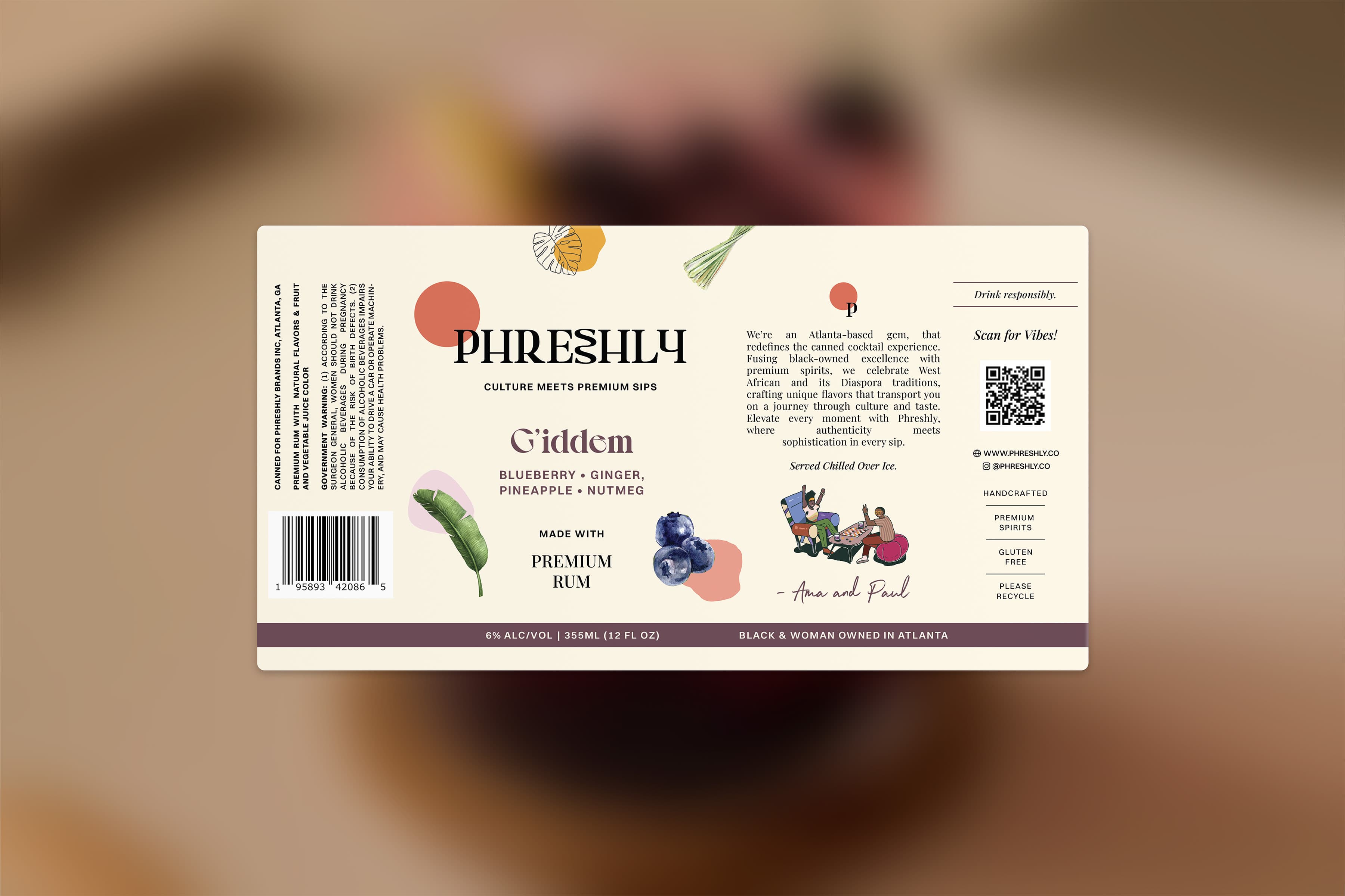
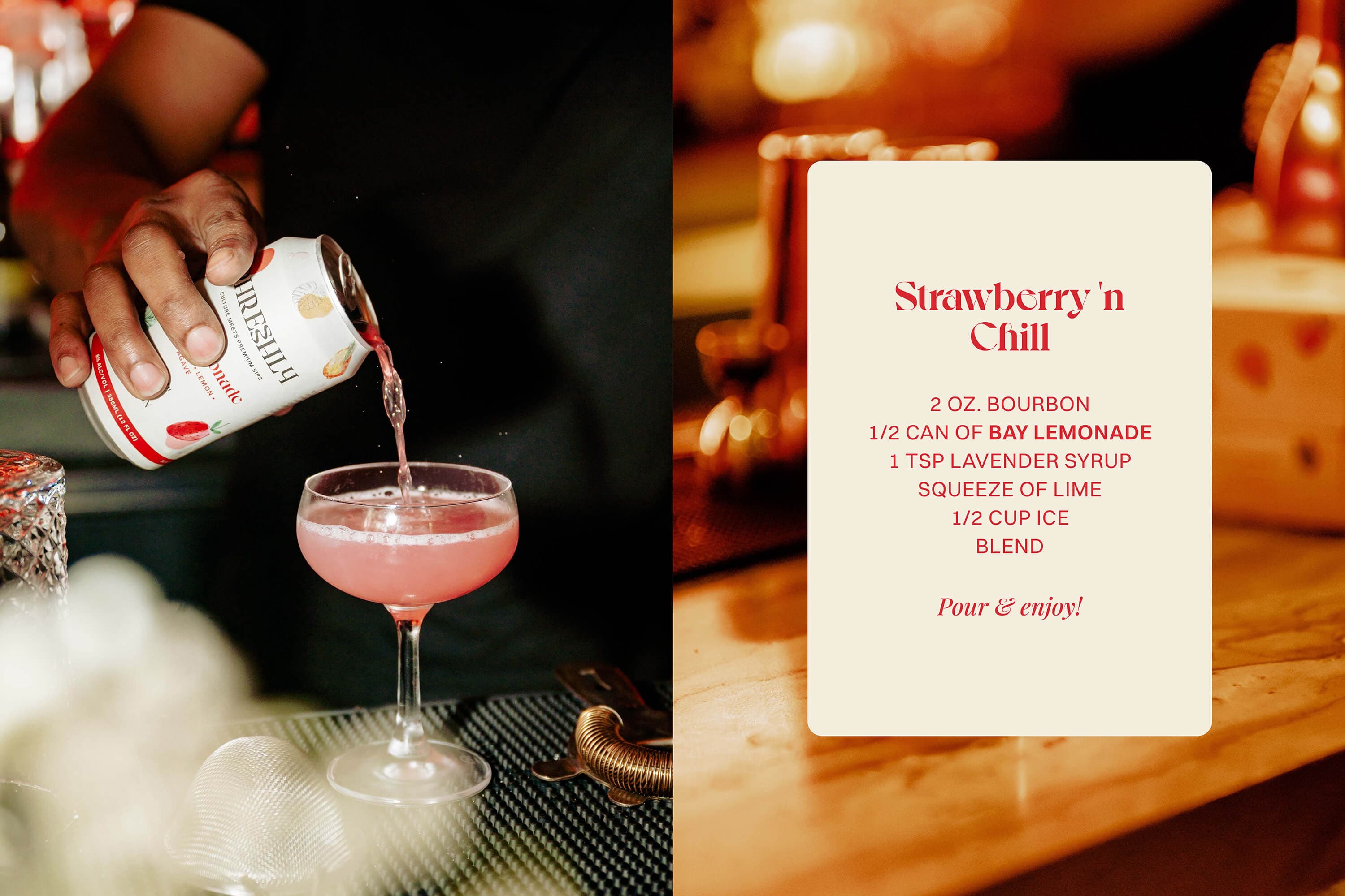
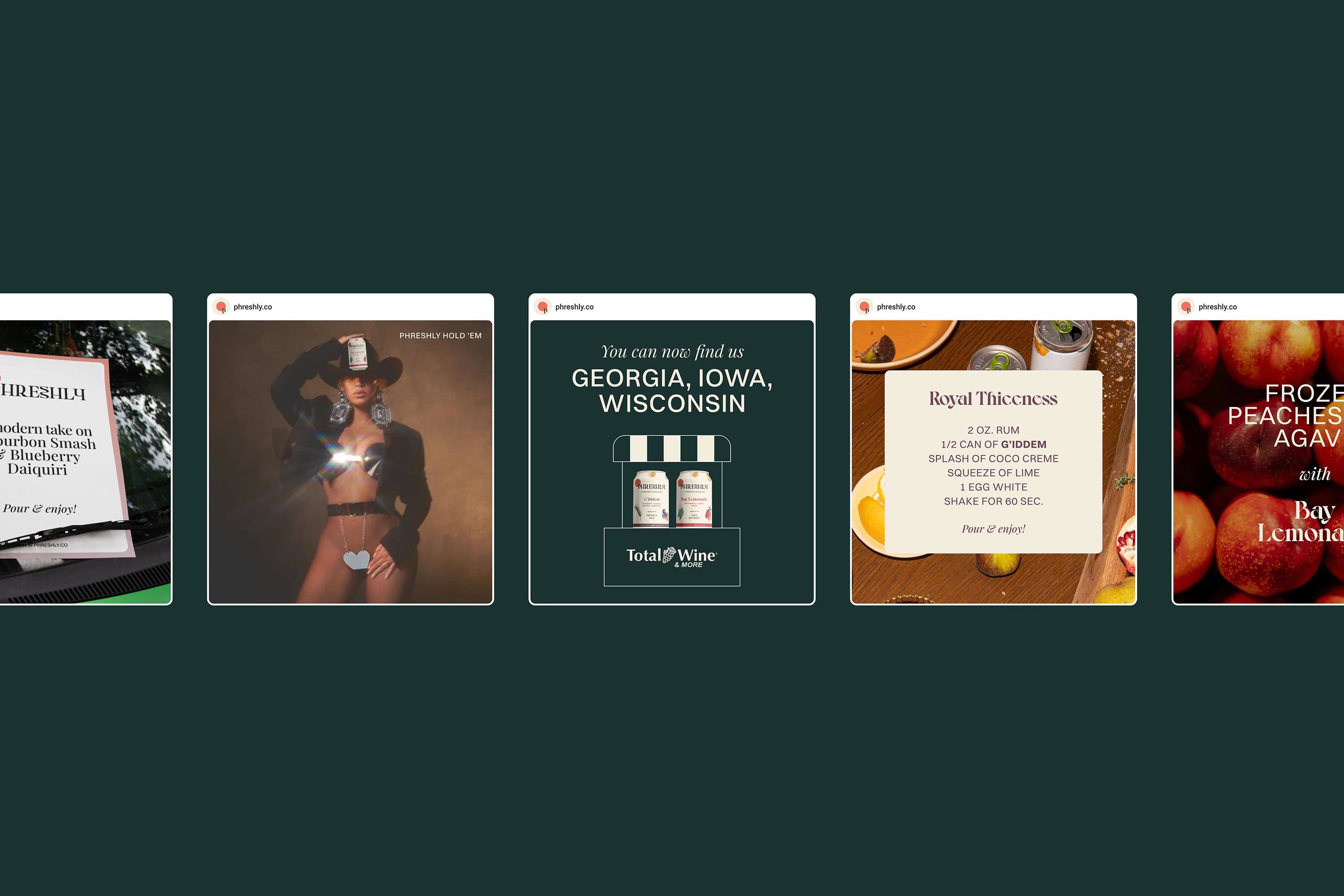
Custom ingredient illustrations make freshness visible and tactile, turning quality into a visual language rather than a claim.
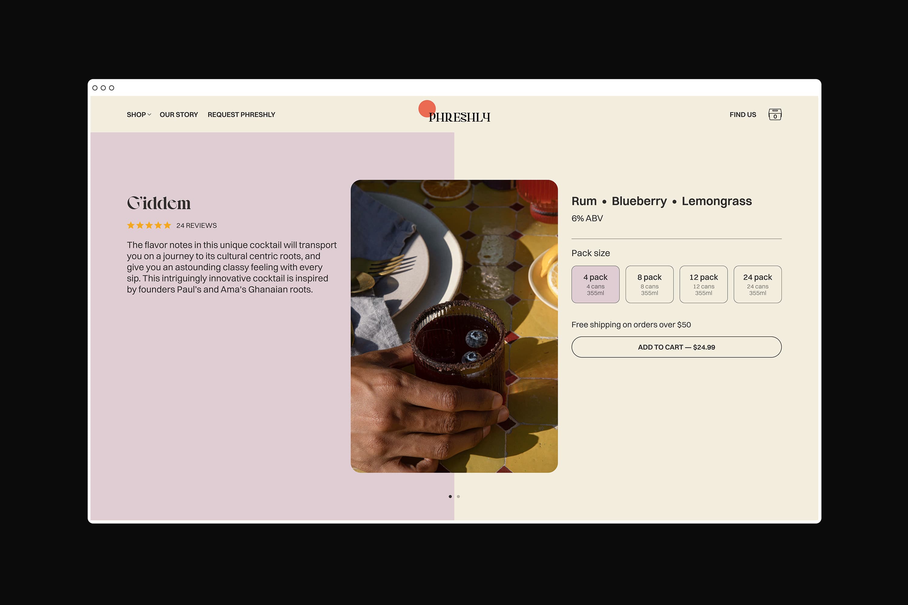
Warm earth tones and rich jewel hues create a strong shelf presence that feels premium and culturally grounded. Key ingredients are highlighted as a core differentiator, reinforcing both quality and storytelling.
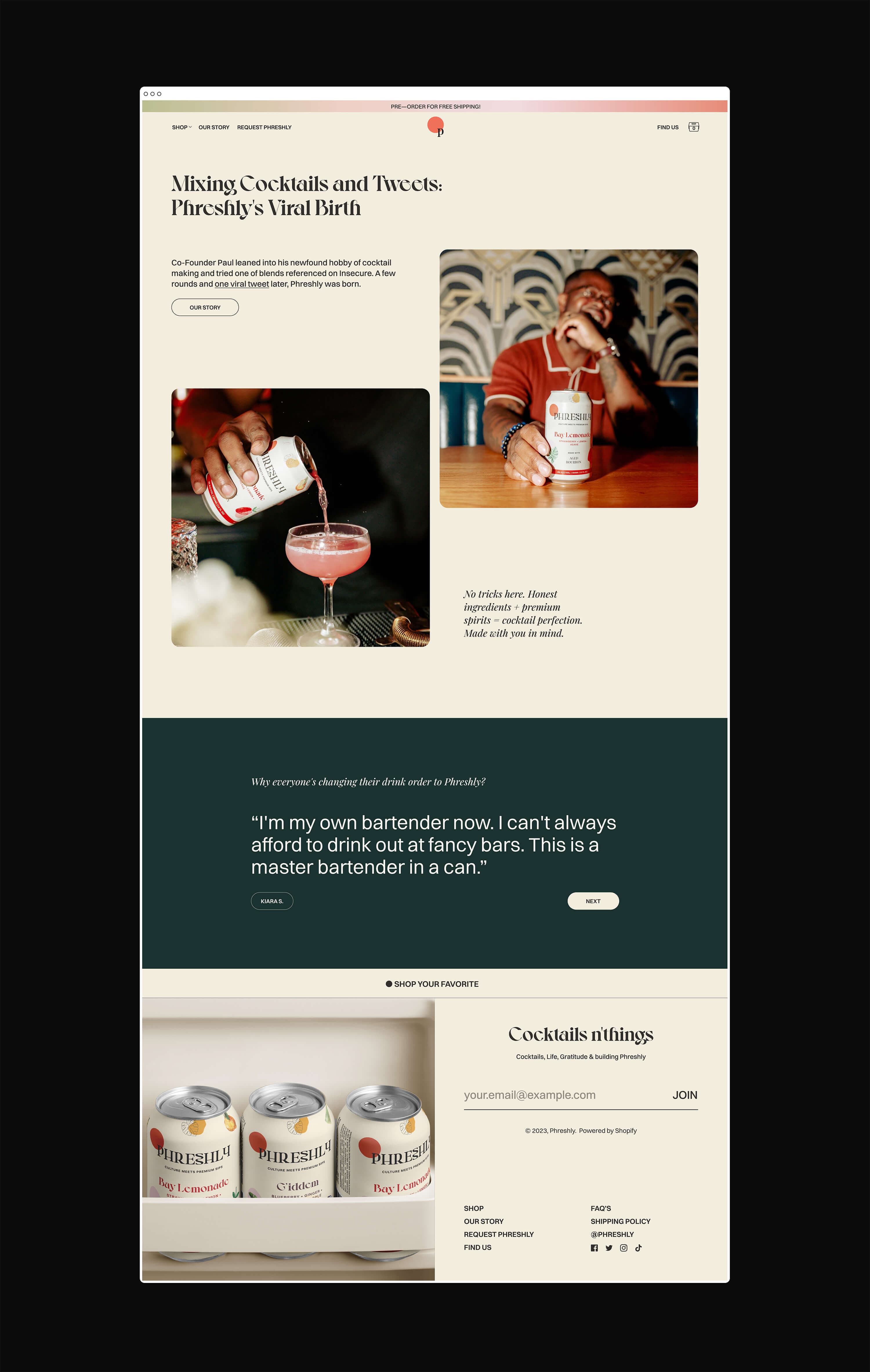
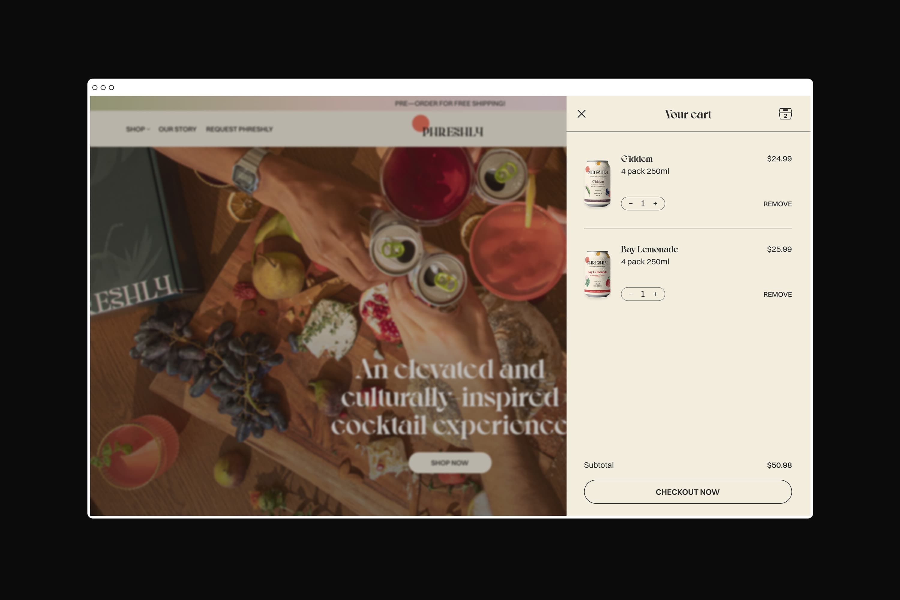
The redesigned packaging and website work together as a cohesive brand system, extending this elevated aesthetic into a digital experience that feels vibrant, confident, and intentional.