WeightQuest
Branding wellness for women who want support, not pressure
About the project
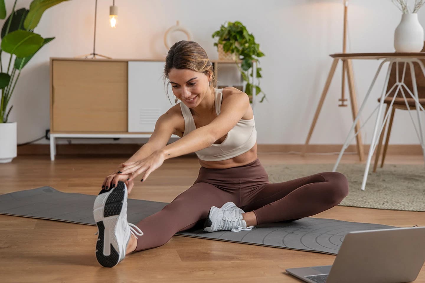
Weight loss is often framed as discipline. Most apps feel either clinical or overwhelming, reducing a deeply personal journey to charts and targets. That was the starting point for WeightQuest.
Women don’t need another app that judges them or pushes perfection. They need something that feels personal, steady, and encouraging, a system that supports real life, not just ideal outcomes. WeightQuest came to us to create a brand that could hold that balance: structured, but compassionate.
The truth
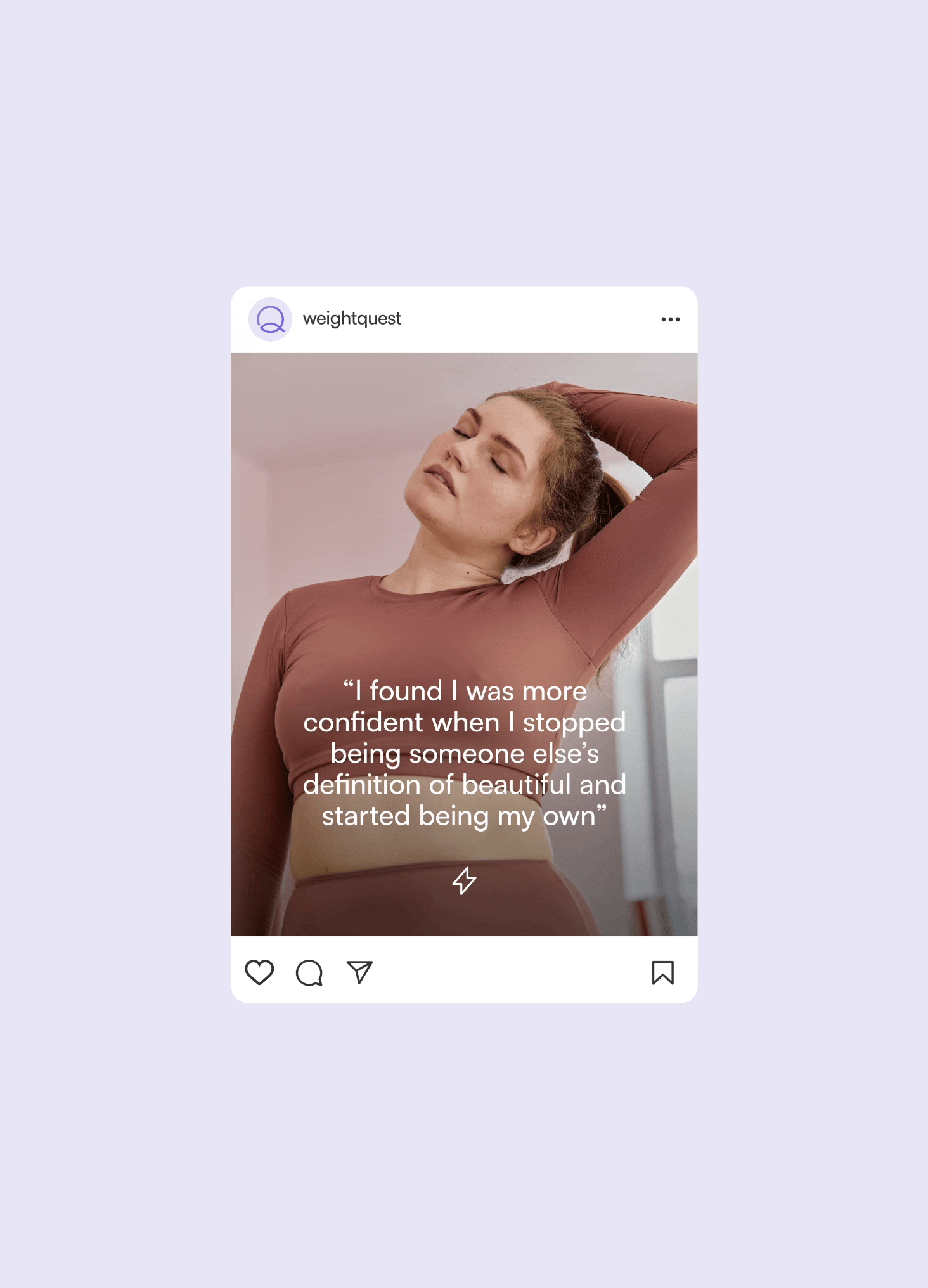
Health journeys are emotional. Yet most tools reduce them to data points: charts, calories, metrics. The experience becomes transactional instead of transformational. The opportunity was to design something that feels guided, not monitored.
The pattern
The wellness category often swings between two extremes: either hyper-medical and technical, or overly soft and pastel. Our role as brand strategists and designers was to find clarity between those worlds. We wanted WeightQuest to feel modern and intelligent, but also calm and human.
The core
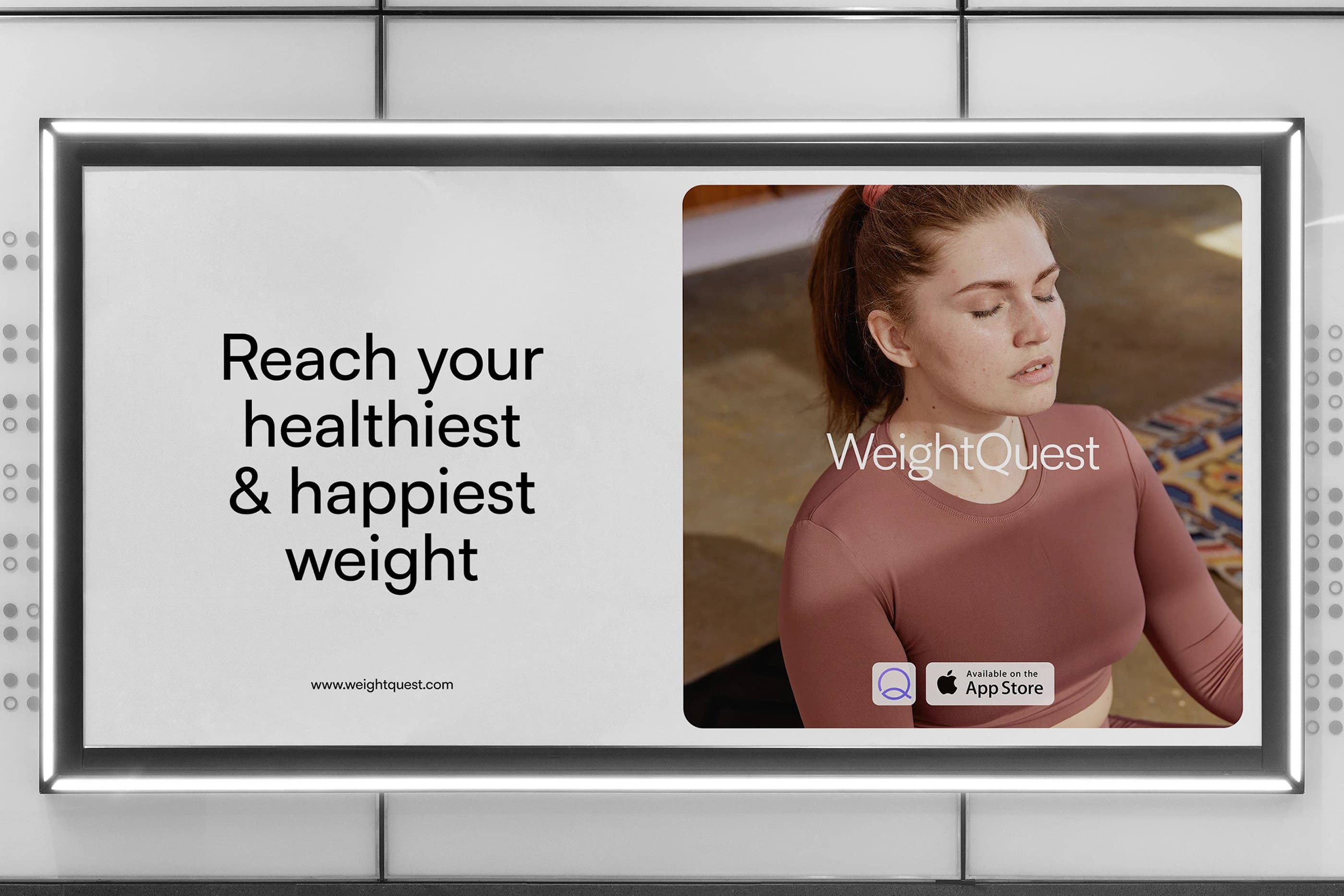
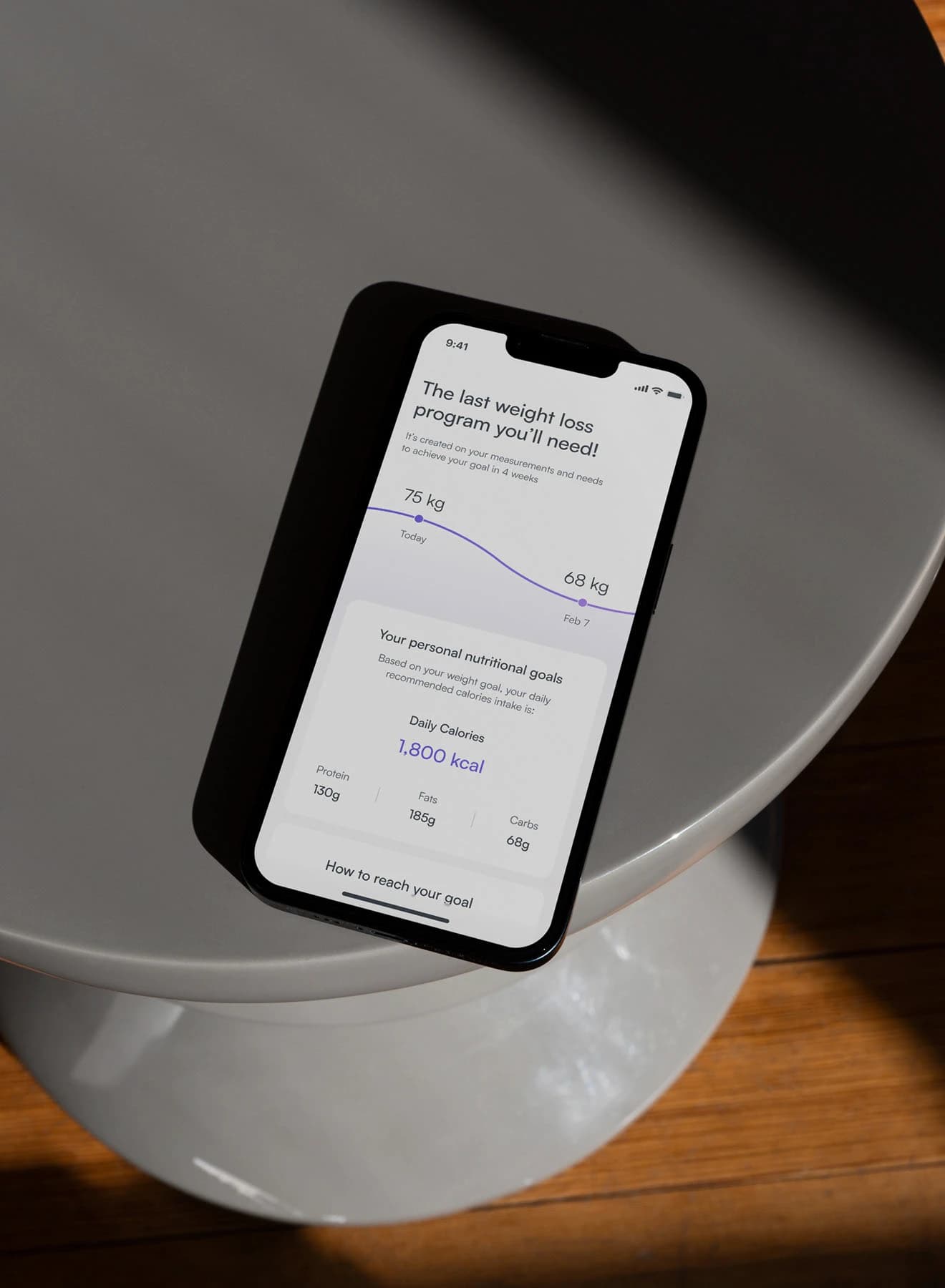
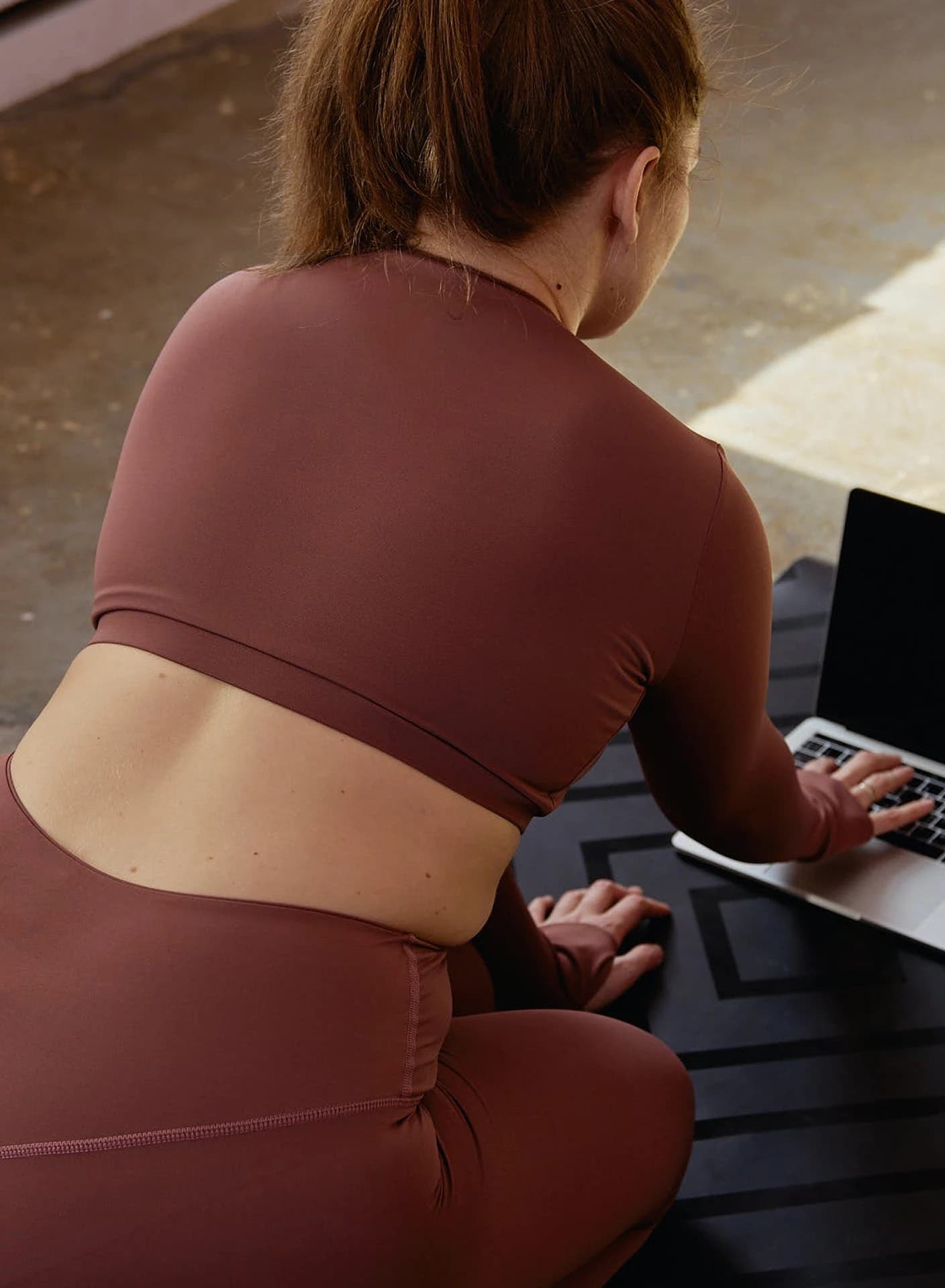
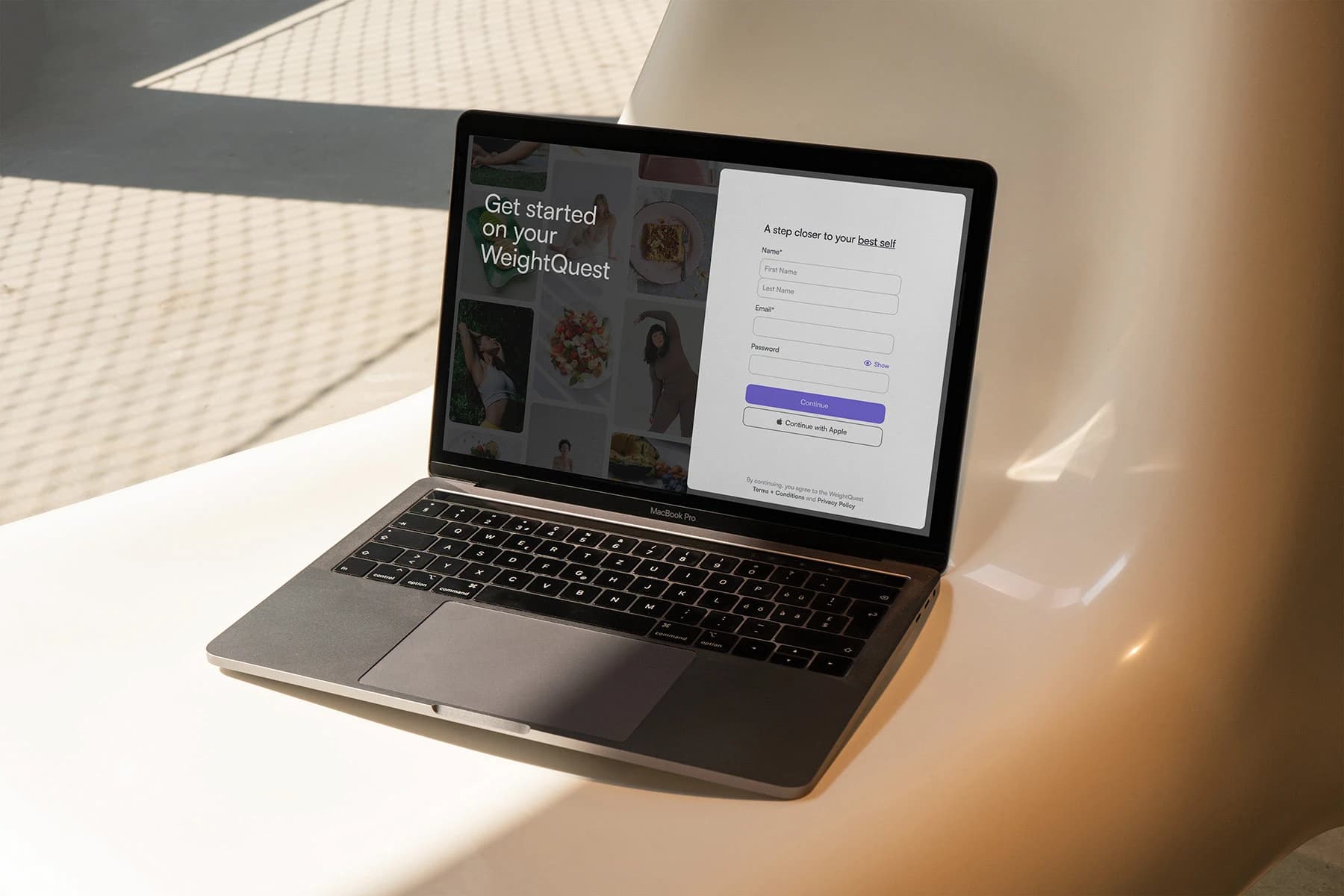
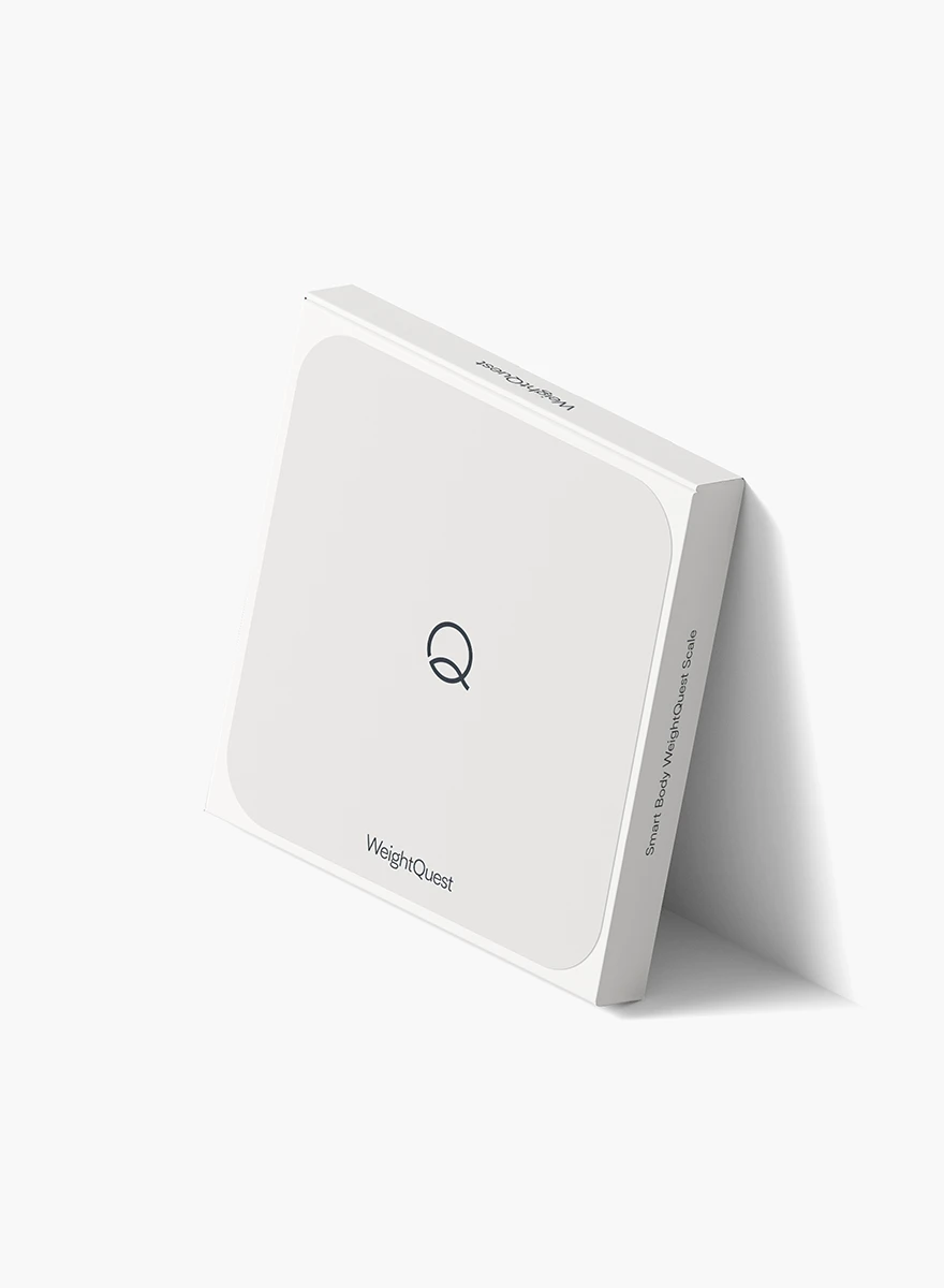
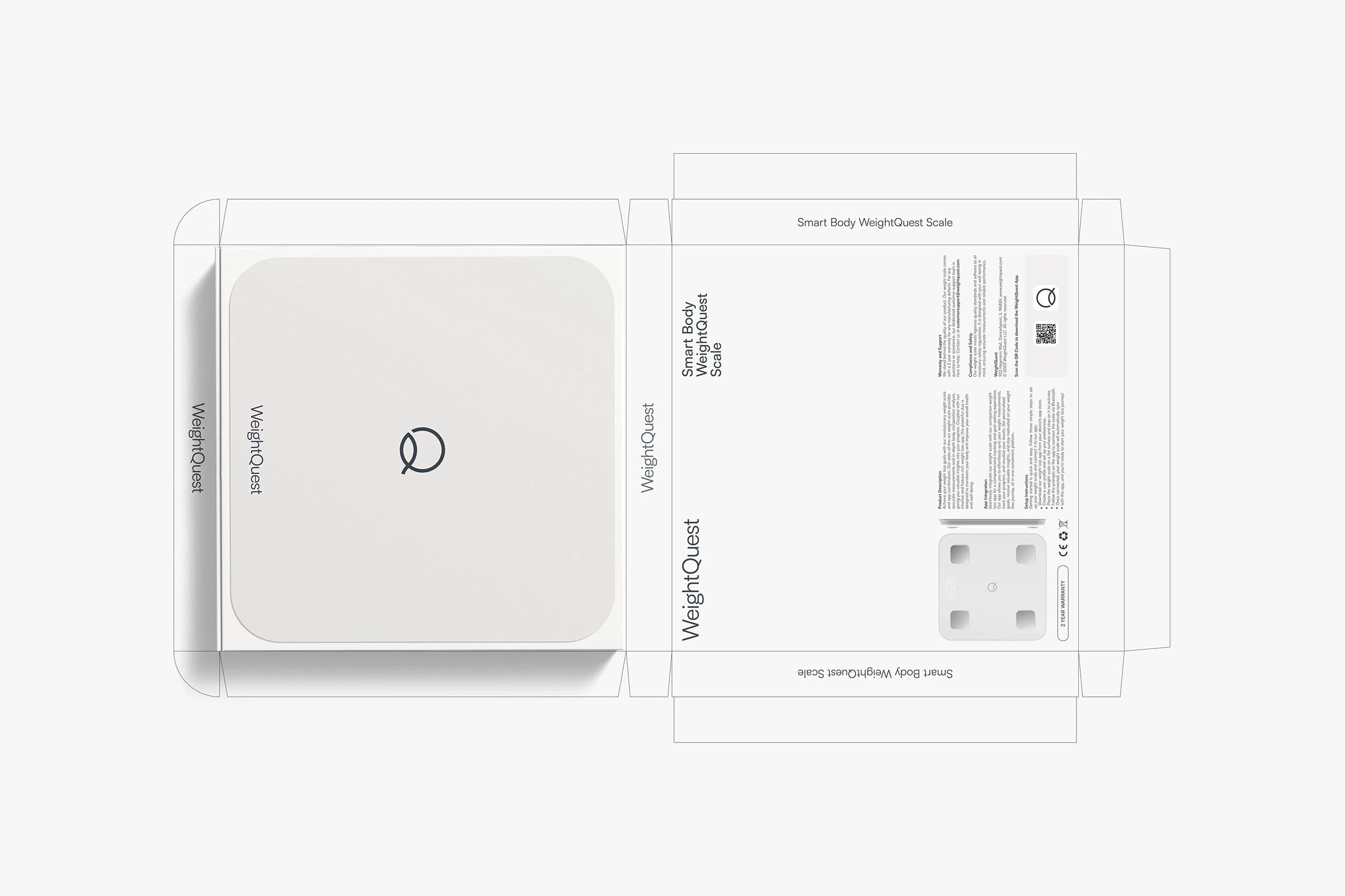
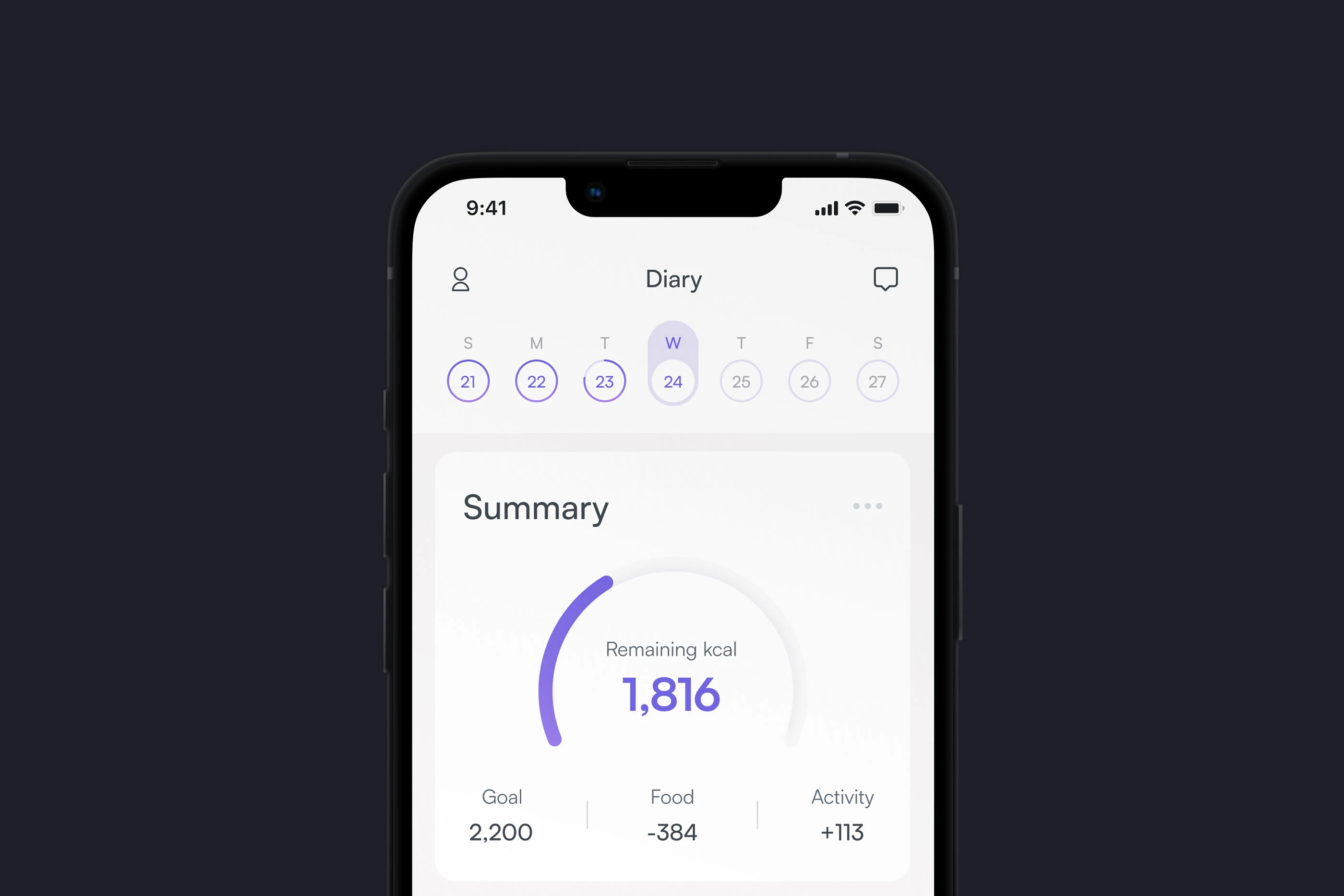
WeightQuest combines a smart scale, a mobile app, and personalized coaching into one seamless system. We shaped the brand to reflect simplicity, empowerment, and holistic well-being. The tone is supportive and direct, and clear without being harsh. We built a clean and intuitive identity system that prioritizes ease.
The form
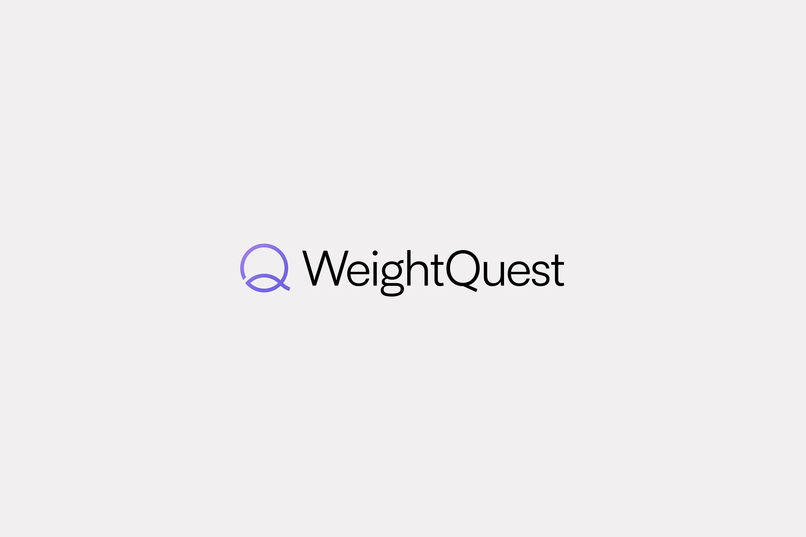
The logo is simple and contemporary, built with smooth, rounded geometry that feels approachable and balanced.
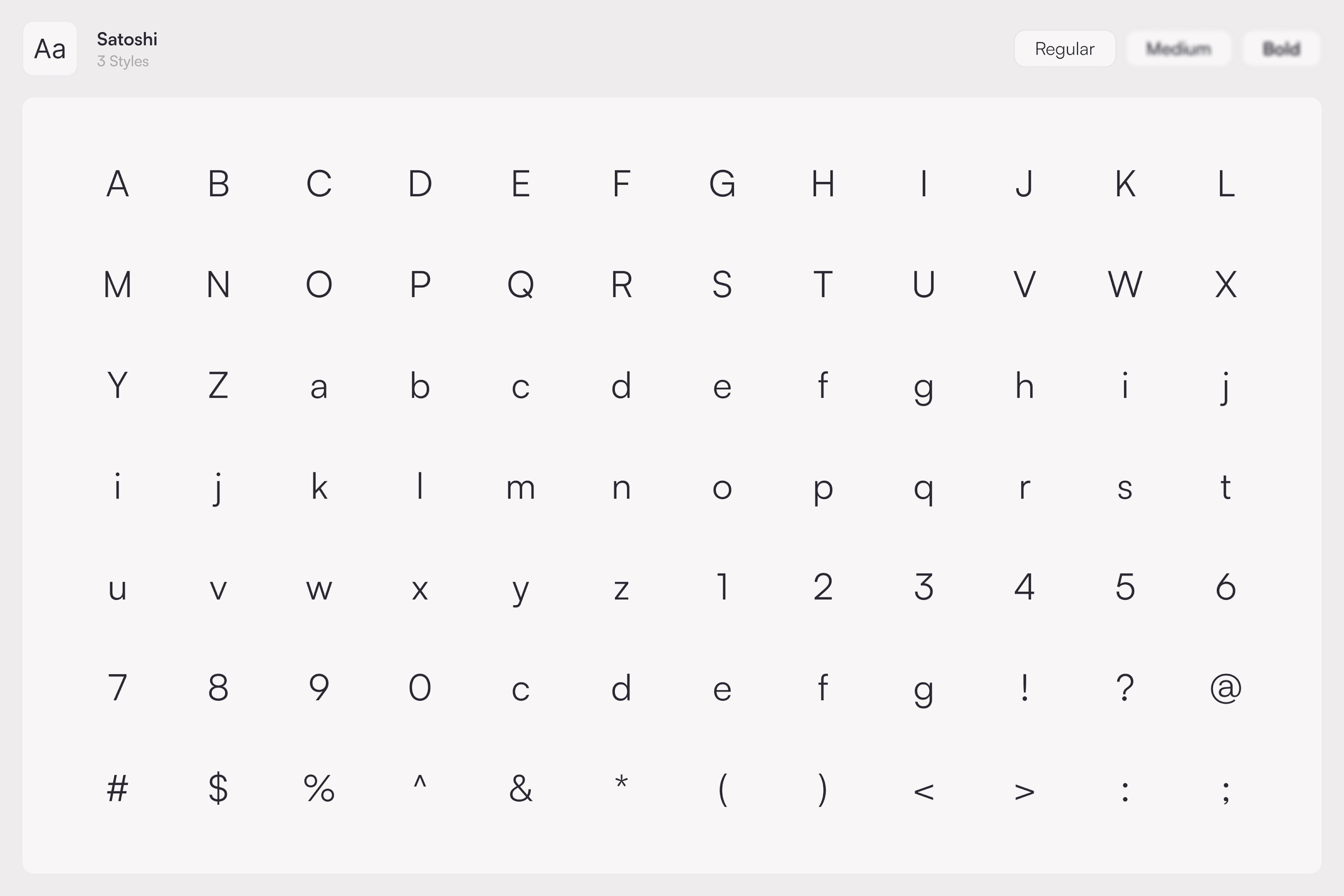
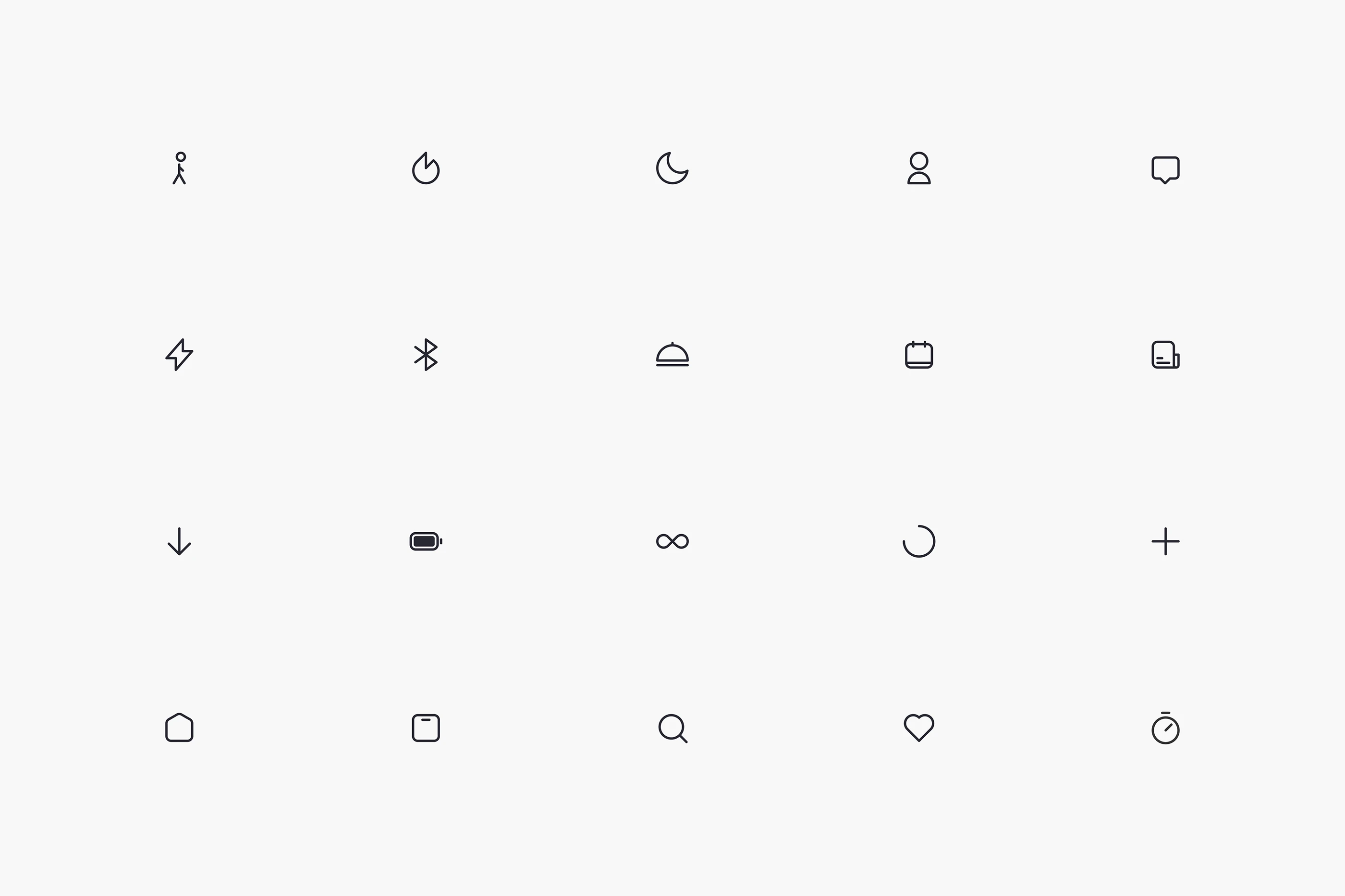
The color palette centers around a calming purple, supported by neutral tones that create clarity and contrast. The typography is modern, legible, and consistent across every touchpoint, reinforcing trust and ease.
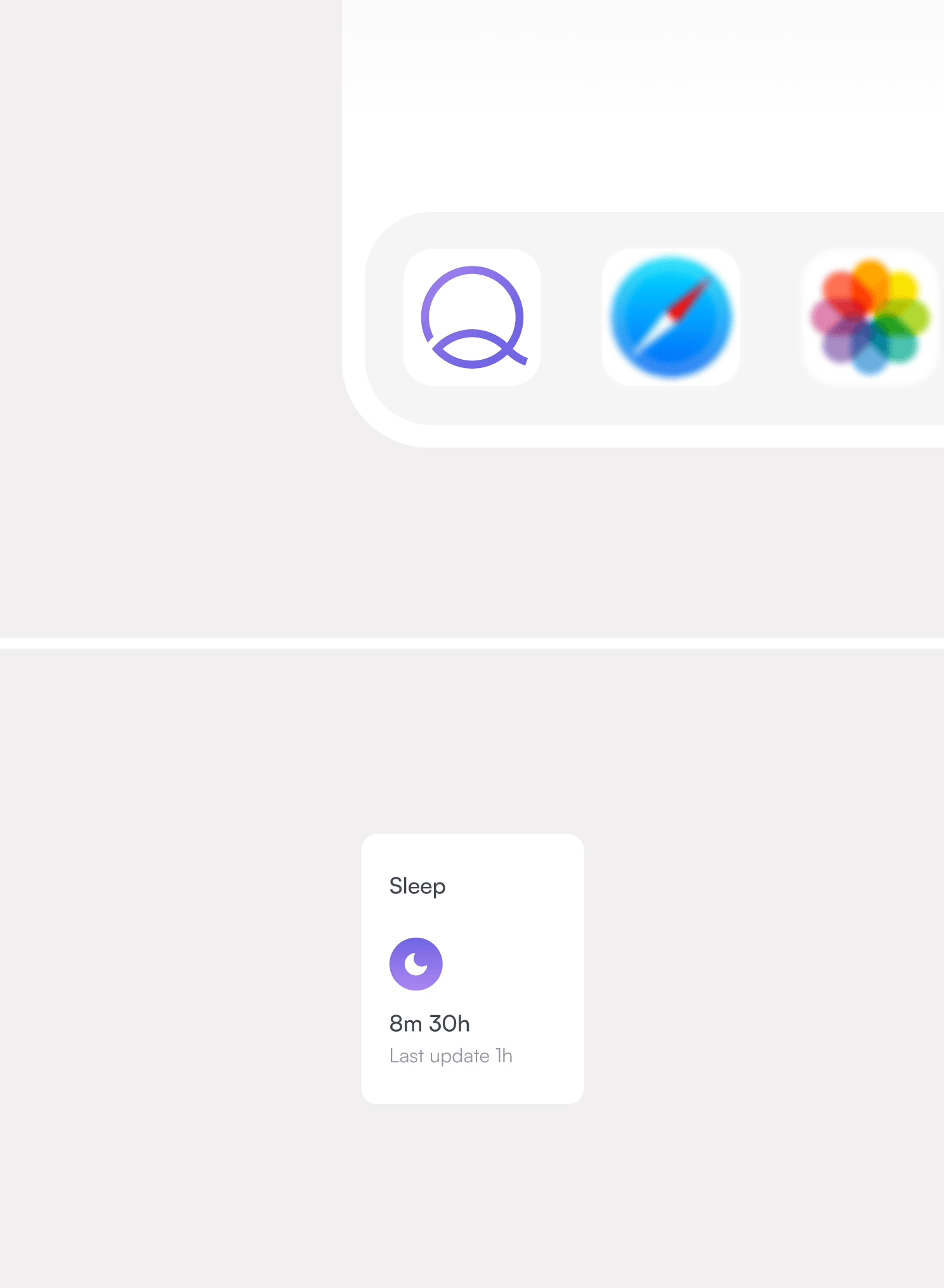
The app experience was designed to remove friction. Connecting the scale feels effortless. Tracking feels intuitive. Every interaction supports momentum without creating pressure.